
The Google has just announced that it will take mobile friendliness as a ranking signal starting April 21, 2015. Although Google has already prioritized to find more mobile friendly websites in the search engines during a search from mobile devices, they will take mobile friendliness as a ranking signal even seriously and the impact is expected to be more significant.
Starting April 21, we will be expanding our use of mobile-friendliness as a ranking signal. This change will affect mobile searches in all languages worldwide and will have a significant impact in our search results. Consequently, users will find it easier to get relevant, high quality search results that are optimized for their devices.
According to Neil Patel from QuickSprout.com, the algorithm change will have even huge impact than penguin and panda update.
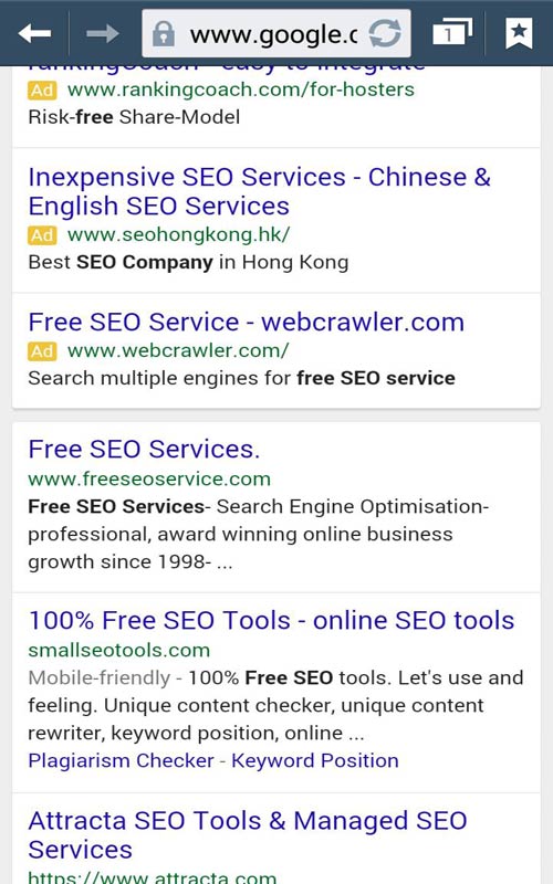
Mobile Search for ‘free SEO Service’
This is what I got into Google’s first page when I searched for ‘free SEO Service’ keyword. You could see on the second place result a mobile-friendly notification which ensures that the website pass the mobile friendly test, but the first place result does not pass the test. This means either the first place website will loose its position after the algorithm update in April 21, or it has to adapt in order to make better experience for the mobile users.
Why Google needs to take this seriously?
Mobile traffic are taking a huge part, and in most of the cases, the traffic from mobile devices have even huge share then from the desktop. Alongside, Google is world’s largest mobile system provider(Android), has largest mobile application store(Google Play) and is the most used mobile search engine.

January 2015 traffic breakdown of pinchofyum.com
As you can see above, almost 65% of traffic of pinchofyum.com comes from mobile devices which eventually proves how important it is for Google to consider a mobile friendly environment.
What is a mobile friendly website ?
Thanks to Google, it is quite easy to find out which website is mobile friendly, just hit up a test in webmaster mobile friendly test, and you will notice if the device is mobile friendly or not.
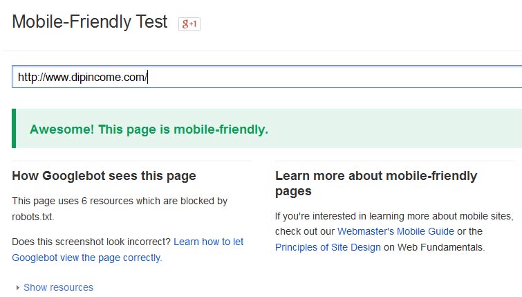
Thank fully I am mobile-Friendly
Now what if your website is not mobile-friendly. Either make all the necessary changes that is explained in the test or sit back and expect a huge blow in your traffic.
Making Necessary Changes for mobile Friendliness
1. Responsiveness
Go for a responsive redesign. Responsiveness means a feature that would automatically fit a user’s screen no matter what device the user is using. This could be super easy to adapt for WordPress users, which means you can choose from a wide range of free or paid responsive themes.
If you need to upgrade your current design to a responsive one, you can contact me for a super cheap quote.
2. Start your site with web starter Kit
There is a tutorial from Google itself on this, you could follow this guide in order to start your site with web starter kit.
3. Dynamic Serving
Dynamic serving is a feature where servers responses with different HTML and CSS for a request from desktop and mobile devices depending on the user agent requesting the pages.
The complete guide on this topic can be seen here.
4. Separate URLs
Yelp.com has dominated the most of the search results when it comes to mobile device searches. Search for yelp and you will see a separate url for mobile searches(m.yelp.com). This means certainly Google would know you are serious about your mobile users.
In this configuration, each desktop URL has an equivalent mobile URL.
You need to signal the relation between two URL with rel=”canonical” and rel=”alternate” and must be able to redirect user to respective pages with the help of user agent.
1. On the desktop page, add rel=”alternate” and on the mobile page, add rel=”canonical”.
2. Redirect properly in respect to the device your user is from.
5. Consider Speed
The mobile optimized websites are always faster to load and less sized. Since people may be on cellular networks, they would prefer a fast loading websites and Google’s main aim remains to make a better user experience. So you must consider speed if you want to get the most out of Google’s next algorithm update.
Tips on hiring a mobile developer
1. References and Portfolio – Ask to reference your developer with the portfolios and make sure they are user friendly. Check if the developer could develop a mobile friendly responsive web site design.
2. Commitment for Speed – Speed is another factor, even in a desktop or a mobile device. Ask your developer to commit for better loading before you get into contract.